WeMoveX Design System
A comprehensive guide to the visual language, components, and patterns used across the WeMoveX platform. Built with Tailwind CSS v4, Base UI, and React 19.
Colors
Our color system uses OKLCH color space for perceptual uniformity. The primary pink/rose palette creates a distinctive brand identity.
Core Palette
Chart Colors
Primary Brand Color
oklch(0.59 0.22 1)
High chroma pink used for primary actions, CTAs, and brand accents
Usage Guidelines
// Semantic color usage
<div className="bg-primary text-primary-foreground">Primary button</div>
<div className="bg-muted text-muted-foreground">Secondary content</div>
<div className="border-border">Border color</div>
<div className="bg-destructive text-white">Error state</div>

// Direct CSS variable access
style={{ backgroundColor: 'var(--primary)' }}
Typography
We use Inter for body text and UI elements, with Geist Mono for code and numerical displays.
Font Families
The quick brown fox jumps over the lazy dog
Used for body text, headings, and all UI elements
1234567890
Used for code, pricing, and tabular data
Type Scale
Font Weights
Spacing & Border Radius
Consistent spacing and rounded corners create visual harmony across the interface.
Border Radius Scale
Component Radius Guidelines
- Buttons, Inputs, Badges
rounded-4xl - Cards
rounded-2xl - Dropdowns, Select Items
rounded-xl - Textarea
rounded-xl - Alert Dialogs
rounded-4xl
Design principle: Higher-level interactive elements (buttons, inputs) use maximum roundness (4xl), while containers (cards, panels) use moderate roundness (2xl) to create visual hierarchy.
Spacing Scale
Spacing values in Tailwind are based on 4px increments (1 = 4px, 2 = 8px, etc.)
Inputs
Form inputs with consistent styling, focus states, and validation feedback.
Basic Input
Input with Icons (Input Group)
Textarea
Select
Usage
import { Input } from "@/components/ui/input"
import { InputGroup, InputGroupAddon, InputGroupInput } from "@/components/ui/input-group"

// Basic input
<Input placeholder="Enter text" />

// Input with icon
<InputGroup>
  <InputGroupAddon align="inline-start">
    <MailIcon className="size-4" />
  </InputGroupAddon>
  <InputGroupInput placeholder="Email" />
</InputGroup>
Cards
Container components for grouping related content with consistent padding and borders.
Basic Card
This is the main content area of the card. You can put any content here including text, images, forms, etc.
Card Sizes
Default card with standard spacing for general use.
Smaller card for compact layouts.
Usage
import { Card, CardHeader, CardTitle, CardDescription, CardContent, CardFooter } from "@/components/ui/card"

<Card>
  <CardHeader>
    <CardTitle>Title</CardTitle>
    <CardDescription>Description</CardDescription>
  </CardHeader>
  <CardContent>Content goes here</CardContent>
  <CardFooter>
    <Button>Action</Button>
  </CardFooter>
</Card>
Badges
Small labels for categorization, status indication, and counts.
Variants
With Icons
Usage
import { Badge } from "@/components/ui/badge"

<Badge>Default</Badge>
<Badge variant="secondary">Secondary</Badge>
<Badge variant="outline">Outline</Badge>
Form Patterns
Consistent field layouts with labels, descriptions, and error states.
Field Components
Enter your name as it appears on your ID.
Field Groups
Usage
import { Field, FieldLabel, FieldDescription, FieldError } from "@/components/ui/field"

<Field>
  <FieldLabel htmlFor="email">Email</FieldLabel>
  <Input id="email" placeholder="john@example.com" />
  <FieldDescription>We'll never share your email.</FieldDescription>
</Field>

// With error
<Field>
  <FieldLabel htmlFor="email">Email</FieldLabel>
  <Input id="email" aria-invalid="true" />
  <FieldError>Please enter a valid email.</FieldError>
</Field>
Brand Assets
Custom illustrated assets that represent WeMoveX's transport services. Each illustration follows a consistent visual language using the brand color palette.
Illustration Style Guide
- Bold vector illustrations with clean, geometric lines
- Isometric-style perspective for depth and dimension
- Stylized shadows using dark navy (#1a1a2e)
- WeMoveX branding integrated into vehicle illustrations
Primary Pink
Light Pink
White
Dark Navy
Logo
Primary logo on light backgrounds. Uses brand pink gradient.
Logo on dark backgrounds using CSS invert filter.
Vehicle Type Illustrations
12 custom illustrations representing different transport categories. Each PNG has a transparent background for flexible use on various backgrounds.
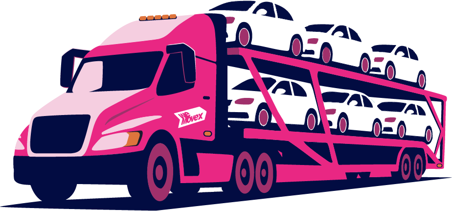
Cars, SUV's & 4WD's
Reliable transport for standard passenger vehicles, ensuring safe and efficient delivery for everyday cars and smaller SUVs.
/wmx/CARS SUV 4WD.pngSedans • Hatches • SUVs • 4WDs • Station Wagons • Utes
Oversized Vehicles
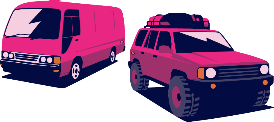
Specialised transport for vans, oversized passenger vehicles, utility vehicles and mine spec vehicles.
/wmx/VANS 4WD.pngLarge SUVs • Vans • Cab Chassis • Mini Bus • Camper Vans
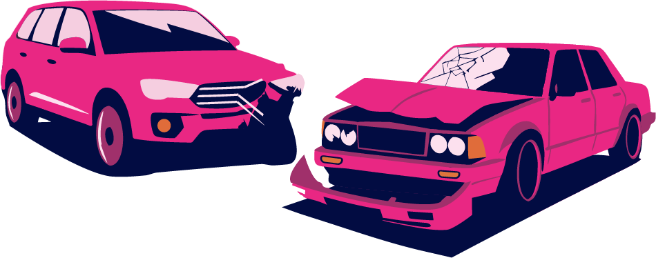
Salvage Vehicles
Transport for damaged or non-operational vehicles, including salvage operations from auction yards.
/wmx/SALAVAGE.pngCars • SUVs • Trucks • Motorbikes • Vans
Caravan & Campers
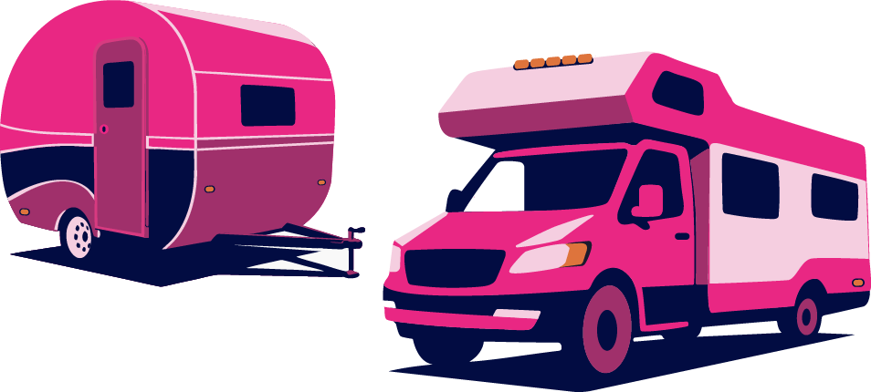
All towable items including camper trailers, caravans and 5th wheelers for your next adventure.
/wmx/CARAVANS CAMPERVANS.pngCaravans • Camper Trailers • 5th Wheelers • Motorhomes
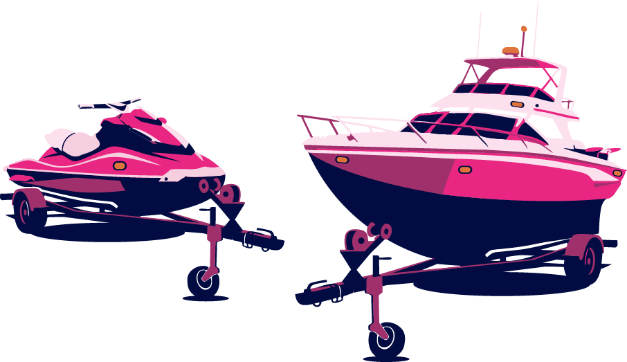
Boats & Jet Skis
Fully enclosed specialised transport for trailered boats and jet skis to any destination.
/wmx/JETSKIS BOATS.pngBoats on Trailer • Jet Skis on Trailer
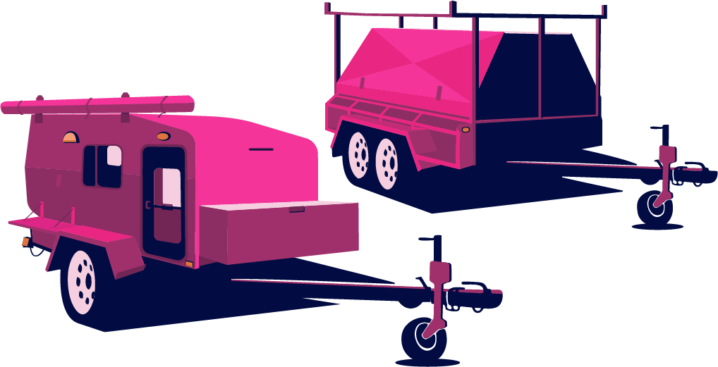
Trailers & Towables
Secure transport for various trailers and towable equipment, ideal for construction and recreation.
/wmx/TRAILERS.pngTrailers • Semi Trailers • Curtain Siders • Tankers
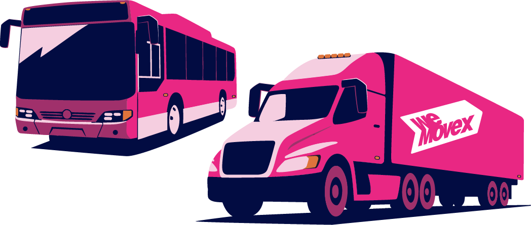
Trucks & Buses
Heavy-duty transport solutions for commercial trucks and passenger buses across Australia.
/wmx/BUSES TRUCKS.pngTrucks • Buses • Tautliners • Semi Trailers • Rigids
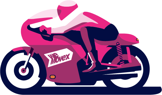
Motorbikes & Quads
Dedicated personalised service for two-wheeled bikes, quads and trikes. Fully enclosed transport.
/wmx/MOTORBIKES.pngMotorcycles • Quads • Trikes • eBikes • Bicycles
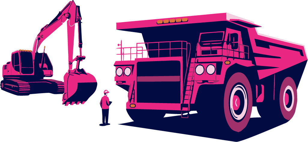
Heavy Machinery
Robust transport for mining and heavy industrial machinery, handling extreme weights and sizes.
/wmx/MINING HEAVY MACHINERY.pngExcavators • Cranes • Tractors • Bulldozers • Bobcats
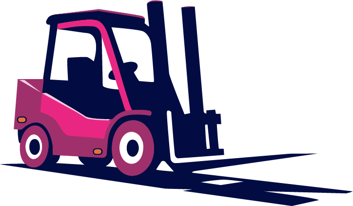
Forklifts & Cranes
Any industrial lifting equipment for warehouses and construction sites. If it has wheels, we move it.
/wmx/FORKLIFTS.pngForklifts • Stackers • Telehandlers • Cherry Pickers
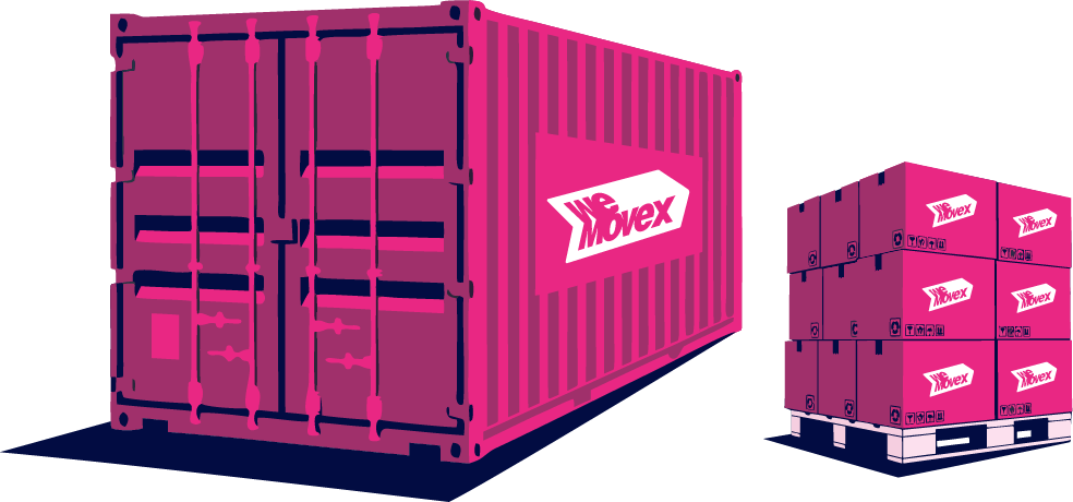
General Freight
Versatile freight services for containers and general palletised cargo. From envelopes to containers.
/wmx/GENERAL FRIEGHT CONTAINERS.pngPallets • Containers • Boxes • Air Freight
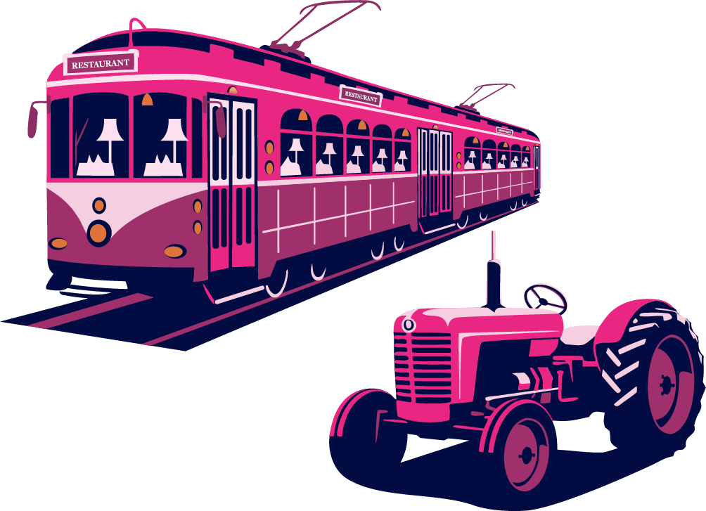
Other Items
For all the items we can't list! If it's moveable, we have a solution. Helicopters to train carriages.
/wmx/OTHER.pngCustom Solutions • Specialty Transport
Asset Usage Guidelines
- • Use on light backgrounds or subtle gradients
- • Maintain aspect ratio when scaling
- • Allow sufficient padding around illustrations
- • Use for service category selection and marketing
- • Place on busy or clashing backgrounds
- • Distort or crop the illustrations
- • Change the brand colors in the illustrations
- • Use at extremely small sizes (<60px height)
File Reference
// Import path for vehicle illustrations
const imagePath = "/wmx/CARS SUV 4WD.png";

// Usage in Next.js Image component
import Image from "next/image";

<Image
  src="/wmx/CARS SUV 4WD.png"
  alt="Cars, SUV's & 4WD's"
  width={400}
  height={250}
  className="object-contain"
/>

// Available files in /public/wmx/:
// - BUSES TRUCKS.png
// - CARAVANS CAMPERVANS.png
// - CARS SUV 4WD.png
// - FORKLIFTS.png
// - GENERAL FRIEGHT CONTAINERS.png
// - JETSKIS BOATS.png
// - MINING HEAVY MACHINERY.png
// - MOTORBIKES.png
// - OTHER.png
// - SALAVAGE.png
// - TRAILERS.png
// - VANS 4WD.png
Animations
Motion adds delight and feedback to interactions. We use Motion (formerly Framer Motion) for complex animations and CSS for simple transitions.
Page Entrance Animations
Header Animations
Special Effects
Liquid Metal Border
Marquee Animation
CSS Animation Classes
/* Entrance animations */
.animate-fade-in-up { animation: fadeInUp 0.8s ease-out forwards; }
.animate-fade-in-scale { animation: fadeInScale 0.5s ease-out 0.3s forwards; }
.animate-slide-in-left { animation: slideInLeft 0.5s ease-out forwards; }
.animate-slide-in-right { animation: slideInRight 0.5s ease-out forwards; }
.animate-slide-in-down { animation: slideInDown 0.5s ease-out 0.1s forwards; }

/* Continuous animations */
.animate-bounce-slow { animation: bounce 2s ease-in-out infinite; }
.animate-marquee { animation: marquee 30s linear infinite; }

/* Special effects */
.btn-liquid-border::before { animation: liquidMetalShine 20s ease-in-out infinite; }
Style Inconsistencies
Identified areas where styling patterns deviate from the established design system. These should be addressed for better consistency.
Raw color values instead of semantic tokens
text-neutral-700, bg-neutral-100, border-neutral-200text-muted-foreground, bg-muted, border-borderInconsistent pink color references
pink-500/20, pink-400 (raw Tailwind)primary/20, primary (semantic tokens)Mixed border-radius values in Drawer
rounded-t-3xl (drawer content)rounded-t-4xl (match dialog and inputs)Hardcoded colors in Drawer
text-neutral-900, text-neutral-500, border-neutral-100, bg-neutral-300text-foreground, text-muted-foreground, border-border, bg-mutedFooter uses raw neutral colors
text-neutral-700, text-neutral-400, border-neutral-200text-foreground, text-muted-foreground, border-borderHero uses white/opacity instead of tokens
text-white/70, text-white/90, bg-white/10Consider creating inverse tokens for dark backgroundsRose-600 used directly in Features
text-rose-600text-primary- Create a lint rule to flag raw color values (neutral-*, pink-*, rose-*) in components
- Add inverse color tokens for use on dark backgrounds (--foreground-inverse, etc.)
- Standardize border-radius to use only the defined scale (rounded-xl, rounded-2xl, rounded-4xl)
- Update Drawer component to use semantic color tokens
- Audit all landing page components for consistent token usage
Questions about the design system?
This guide is maintained by the WeMoveX development team. For updates or suggestions, reach out via the internal channels.